POWER BI DASHBOARD
Data Visualization for Covid Data
Data were excerpted from Kaggle.com which was originally provided by the Mexican Goverment and taken from the first few months in 2020
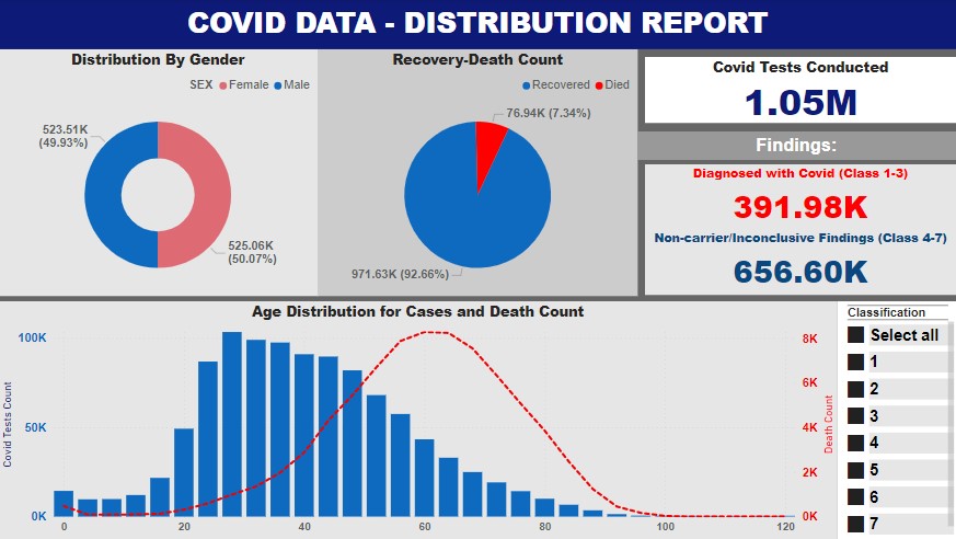
Page 1
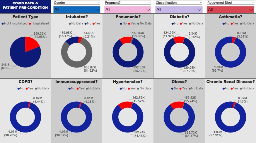
Page 2
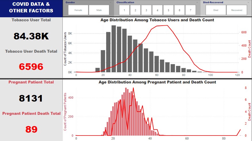
Page 3
Few take-aways based on the visualization:
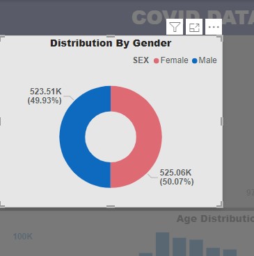
- The gender of the patients were generally comparable which is approximately 50% male and 50% Female.
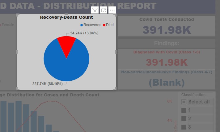
- The percentage of death among the confirmed (diagnosed with Covid under class 1, 2, and 3) is at 13.84% (or 54.24k)
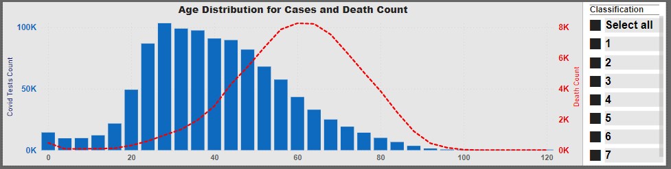
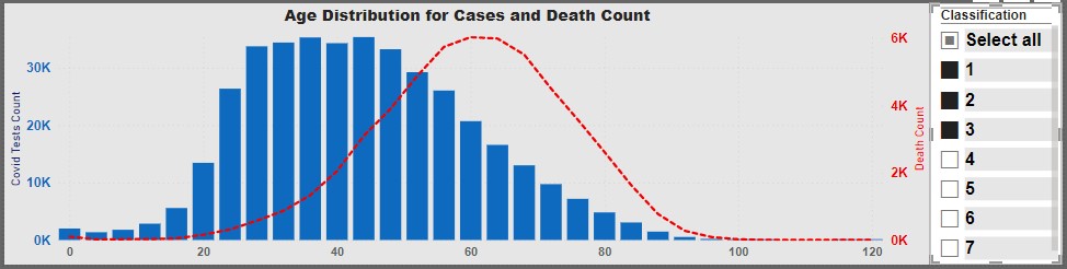
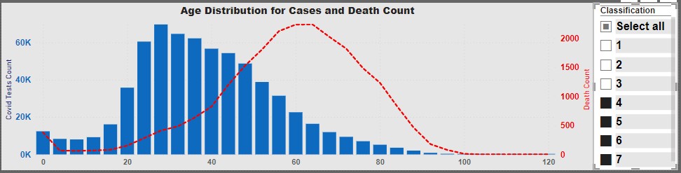
- Death among the age group peaks at about 60 years old.
There's more to know about this covid data with this visualization.
Click on the download file link to explore more.